There are 845 users in the forums
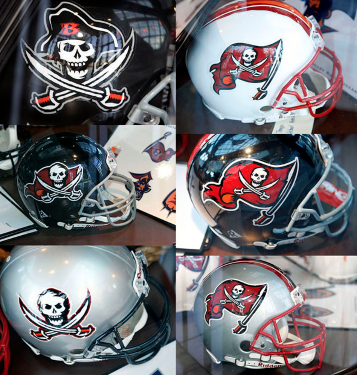
The New "Enhanced Logo" Tampa Bay Bucs Helmet
The New "Enhanced Logo" Tampa Bay Bucs Helmet
Feb 21, 2014 at 12:28 PM
- spizzy
- Veteran
- Posts: 3,493
I think they are dope
Feb 21, 2014 at 12:45 PM
- JimA49ers
- Veteran
- Posts: 5,805
Originally posted by Dr_Bill_Walsh:


That decal is WAY too big. Looks like it is the full size decal, but placed on a mini-helmet. The logo should only be a small portion of the helmet, like the way the "SF" fits perfectly on the Niners helmet. The only ones I agree with are bengals, rams and vikings. rams and vikings horns would look totally stupid if it was just a normal sized decal. And by the way, steelers, reach into your pockets and buy a decal for both sides of the helmet. Don't be so damn cheap.
Feb 21, 2014 at 1:54 PM
- ghostrider
- Veteran
- Posts: 8,671
Aside from being 200% too large, is there any other difference to the actual logo? 
Feb 21, 2014 at 1:58 PM
- Empire49
- Veteran
- Posts: 1,927
Originally posted by Olejohnnyboy:Ahhhhh bottom line is that they're the same ole lowly Bucs. Lol
This.
Don't try to distract us with a new design. We still know you suck, Tampa Bay.
[ Edited by Empire49 on Feb 21, 2014 at 2:02 PM ]
Feb 21, 2014 at 2:24 PM
- CorvaNinerFan
- Veteran
- Posts: 10,447
It looks retarded...not sure what's going on in Tampa Bay, but they need better players, not a bigger logo.
Feb 21, 2014 at 2:47 PM
- GolittaCamper
- Veteran
- Posts: 7,277
Well, you see Florida has a lot of retirees, and old folks don't see so well, the team is just trying to be fan friendly, as some fans were unable to make this logo out on their 1964 19 inch zenith black and white TV's.
Feb 21, 2014 at 3:05 PM
- Dr_Bill_Walsh
- Veteran
- Posts: 20,555
As others have said, I think the Niners' helmet logo is fine and perfectly proportioned as it is....I DO think they ought to crank up the shade of red in the decals a little bit brighter as from AFAR, it looks too dark and doesn't match the shade of red on the jerseys (especially in night games).

Chrome gold helmet shells and facemasks would be too gaudy IMO...plus the recent NFL rule change (to "prevent head injuries/concussions" from unbroken-in helmets ) disallowing different colored helmets for throwbacks/alternate uniforms (unless its close enough to the original, a la, the Rams) makes it a moot point.
Chrome gold helmet shells and facemasks would be too gaudy IMO...plus the recent NFL rule change (to "prevent head injuries/concussions" from unbroken-in helmets
) disallowing different colored helmets for throwbacks/alternate uniforms (unless its close enough to the original, a la, the Rams) makes it a moot point.
[ Edited by Dr_Bill_Walsh on Feb 21, 2014 at 3:11 PM ]
Feb 21, 2014 at 3:58 PM
- SaksV
- Veteran
- Posts: 1,470
Originally posted by GolittaCamper:
Well, you see Florida has a lot of retirees, and old folks don't see so well, the team is just trying to be fan friendly, as some fans were unable to make this logo out on their 1964 19 inch zenith black and white TV's.
LOL reminds me of The Jitterbug cellphone with the giant number pad
Feb 21, 2014 at 4:02 PM
- BadgerHawk
- Veteran
- Posts: 2,547
So it looks like the helmet took a little blue pill. If they play hard for more than four quarters now do they need to call a doctor?
Feb 21, 2014 at 4:08 PM
- GolittaCamper
- Veteran
- Posts: 7,277
Originally posted by SaksV:
Originally posted by GolittaCamper:
Well, you see Florida has a lot of retirees, and old folks don't see so well, the team is just trying to be fan friendly, as some fans were unable to make this logo out on their 1964 19 inch zenith black and white TV's.
LOL reminds me of The Jitterbug cellphone with the giant number pad
I hear Jitterbug has purchased the naming right to their stadium!
Feb 21, 2014 at 5:19 PM
- Dr_Bill_Walsh
- Veteran
- Posts: 20,555
these were rejects from 1997...
Feb 21, 2014 at 7:30 PM
- Handlesit
- Veteran
- Posts: 455
Wouldn't it be wise to have a face mask that wasn't reflective?!?
Feb 21, 2014 at 10:35 PM
- LayTheWoodall
- Veteran
- Posts: 4,513
Most of their rejects from 1997 look better than what they're going with now.
Feb 22, 2014 at 3:59 AM
- xtm059
- Veteran
- Posts: 1,979
Originally posted by spizzy:
I think they are dope
+1
Feb 22, 2014 at 4:00 AM
- xtm059
- Veteran
- Posts: 1,979
top left 97 reject is best reject