[ Edited by Buonaparte69 on Mar 29, 2010 at 03:31:59 ]
There are 142 users in the forums


Originally posted by Buonaparte69:

Originally posted by Buonaparte69:
Arrrgh!!! lol, once again you and your nitpicky colours! that can easily be adjusted in PS...

Originally posted by crzy:Originally posted by Buonaparte69:
Arrrgh!!! lol, once again you and your nitpicky colours! that can easily be adjusted in PS...
lol
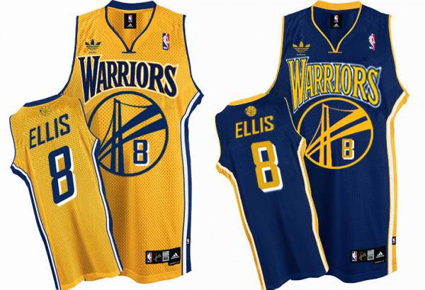
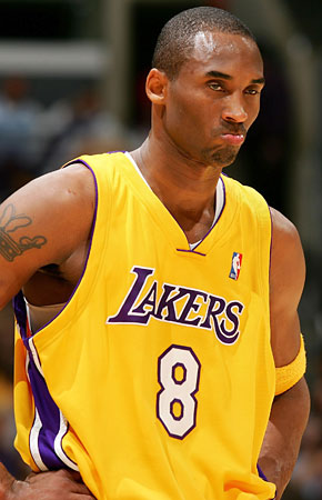
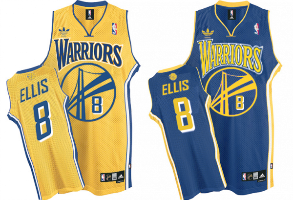
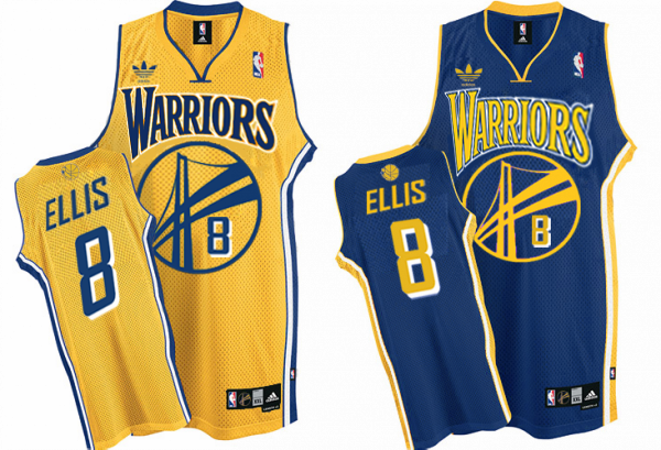
It's because I don't want us to look like the Lakers or the Pacers


Originally posted by TX9R:
I like the old school look but...... why is it only the NBA that teams feel they have to change unis every other year? How many unis have Denver and Dallas had in the last 15 years? Utah has an entirely different color scheme altogether. Am I just old fashioned in that I'd like to see the same uniform I cheered on as a kid?
Another thing the NFL does better, the same SF helmet and for the most part color scheme is the same one I saw The Catch on, and hopefully, the same my son will cheer on with me. And I say this as a Rockets fan who loved the great uni's of the 80s and early 90s turn in to pajamas, and then the Chinese national team.
