As for Seattle's unis I think the away is pretty good... don't like all those flower things or whatever they are inside the numbers and on the side of the legs and around the neck though. The helmet I think that strip of flowers (or whatever that is)... should be way thinner. The Seahawk logo in the back touching together is not good. I think bringing back the grey was one of the things they did right.

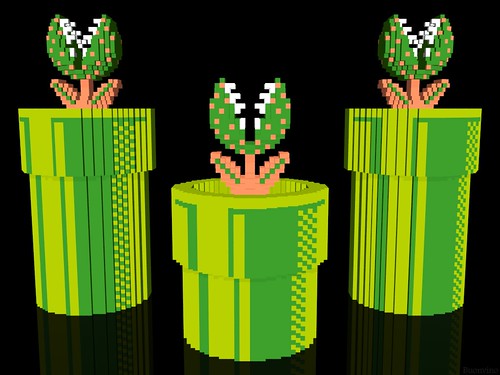
Does anyone actually know what that U type shaped flower thing is? It looks like something on Super Mario Bros 3.

And they put in on the helmet, the side of the pants, inside the numbers, around the back of the neck...

[ Edited by Gore_21 on Apr 3, 2012 at 9:07 PM ]
 <---seahags

 Nike logos or even if they wanted to go way out there pics of the seattle space needle would have been better IMO.