Yeah..it's the Seahawks.
I guess the Bucs next....but those still look 1000x better than the seahawks.
There are 386 users in the forums
Worst NFL uniforms
Nov 26, 2014 at 8:18 PM
- Antix
- Veteran
- Posts: 9,840
Nov 26, 2014 at 8:27 PM
- Seattle49er
- Veteran
- Posts: 1,037
The Steelers throw back bumble bee uniforms, look like prisoners from a honey factory.
Nov 26, 2014 at 8:33 PM
- Dr_Bill_Walsh
- Veteran
- Posts: 20,126
Everything redesigned since Nike took over in 2012:
2012: Seahawks

2013: Jaguars, Dolphins


2014: Buccaneers
Florida got r*ped ....Next year, the Browns are next
2012: Seahawks
2013: Jaguars, Dolphins
2014: Buccaneers
Florida got r*ped
....Next year, the Browns are next
Nov 26, 2014 at 8:48 PM
- JD9671
- Veteran
- Posts: 1,735
Originally posted by Seattle49er:The Steelers throw back bumble bee uniforms, look like prisoners from a honey factory.
This ! Everytime I see those uniforms ! Somebody needs to get fired ! NOW ! Lol ! Then the seagirl ! There year around !

Nov 26, 2014 at 9:16 PM
- zaghawk
- Veteran
- Posts: 2,315
I guess I shouldn't be surprised that most folks on here hate the Hawks uniforms. I think it really has to do with age more than anything. As there were (and still are) a bunch of Hawk fans who hate the current design. I think my only beef with it is the lack of logo. Although I will say during my travels to different areas like NYC and San Diego, I've received compliments from random people saying they thought the Seahawks had at least one of the nicest jerseys out there. They tended to be younger (under 35).
On one hand I do like some of the newer designs because it's refreshing and I do like modern takes on things. on the other hand I do have much respect for some of the older jerseys because they are classic. Like if someone were to say here's a 1960 Mustang Shelby Cobra and here's a 2014 Mustang Shelby Cobra, I really would have a hard time saying which one looks better than the other, both are very nice cars IMO. One being classic, one having a really sweet new design.
So I'll say of the current classic jersey. I've always liked Green Bays. Obviously for the newer designs I like the Hawks.
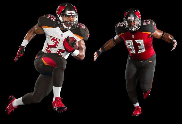
As for the designs above. Jags was fine except for helmet splash/fade. Dolphins really was a minor change, it's fine, nothing spectacular or gross. I felt the Bucs one is bad. I don't mind the helmet, but the jersey itself is gross. I think it's the Digital Number.
As far as Nike vs Reebok. I like Nike better, I've always liked their gear and shoes better in general. I like the look of the more i dunno spandex tight flexing jersey vs the ventilated ones. Honestly, I've just never been a fan of the jerseys with huge ventilation to the point where it bleeds through the numbers.
On one hand I do like some of the newer designs because it's refreshing and I do like modern takes on things. on the other hand I do have much respect for some of the older jerseys because they are classic. Like if someone were to say here's a 1960 Mustang Shelby Cobra and here's a 2014 Mustang Shelby Cobra, I really would have a hard time saying which one looks better than the other, both are very nice cars IMO. One being classic, one having a really sweet new design.
So I'll say of the current classic jersey. I've always liked Green Bays. Obviously for the newer designs I like the Hawks.
As for the designs above. Jags was fine except for helmet splash/fade. Dolphins really was a minor change, it's fine, nothing spectacular or gross. I felt the Bucs one is bad. I don't mind the helmet, but the jersey itself is gross. I think it's the Digital Number.
As far as Nike vs Reebok. I like Nike better, I've always liked their gear and shoes better in general. I like the look of the more i dunno spandex tight flexing jersey vs the ventilated ones. Honestly, I've just never been a fan of the jerseys with huge ventilation to the point where it bleeds through the numbers.
Nov 26, 2014 at 9:53 PM
- KaeptinKrunch
- Veteran
- Posts: 133
Worst
1. Jags (those helmets )
)
2. Bucs
3. Bills
4. Redskins
5. Browns
Best
1. 49ers (obviously)
2. Raiders (gna get some hate for this)
3. Vikings
4. Eagles
5. Cowboys
1. Jags (those helmets
)2. Bucs
3. Bills
4. Redskins
5. Browns
Best
1. 49ers (obviously)
2. Raiders (gna get some hate for this)
3. Vikings
4. Eagles
5. Cowboys
Nov 26, 2014 at 10:00 PM
- JD9671
- Veteran
- Posts: 1,735
Originally posted by zaghawk:I guess I shouldn't be surprised that most folks on here hate the Hawks uniforms. I think it really has to do with age more than anything. As there were (and still are) a bunch of Hawk fans who hate the current design. I think my only beef with it is the lack of logo. Although I will say during my travels to different areas like NYC and San Diego, I've received compliments from random people saying they thought the Seahawks had at least one of the nicest jerseys out there. They tended to be younger (under 35).
On one hand I do like some of the newer designs because it's refreshing and I do like modern takes on things. on the other hand I do have much respect for some of the older jerseys because they are classic. Like if someone were to say here's a 1960 Mustang Shelby Cobra and here's a 2014 Mustang Shelby Cobra, I really would have a hard time saying which one looks better than the other, both are very nice cars IMO. One being classic, one having a really sweet new design.
So I'll say of the current classic jersey. I've always liked Green Bays. Obviously for the newer designs I like the Hawks.
As for the designs above. Jags was fine except for helmet splash/fade. Dolphins really was a minor change, it's fine, nothing spectacular or gross. I felt the Bucs one is bad. I don't mind the helmet, but the jersey itself is gross. I think it's the Digital Number.
As far as Nike vs Reebok. I like Nike better, I've always liked their gear and shoes better in general. I like the look of the more i dunno spandex tight flexing jersey vs the ventilated ones. Honestly, I've just never been a fan of the jerseys with huge ventilation to the point where it bleeds through the numbers.
 Why are you on our webzone ?
Nov 26, 2014 at 10:31 PM
- BobS
- Veteran
- Posts: 10,699
Originally posted by LasVegasWally:
The retro uniforms really suck.
I think the 1934 Steelers are the worst of the group.
Nov 26, 2014 at 10:35 PM
- LayTheWoodall
- Veteran
- Posts: 4,056
I hated the neck design that we had for our 2009-2011 jerseys (Reebok), and I don't like the Reebok and Nike designs both have "49ers" on the upper chest.
And aside from "hating" because of the "rivalry" I actually think the Cawks current uniforms are worse than the 2002-2011 ones. They don't even look like an NFL jersey, they look like something out of Arena Football.
And aside from "hating" because of the "rivalry" I actually think the Cawks current uniforms are worse than the 2002-2011 ones. They don't even look like an NFL jersey, they look like something out of Arena Football.
Nov 26, 2014 at 11:48 PM
- Niners99
- Veteran
- Posts: 43,194
1. Bucs
2. Jags
3. Seahawks
The worst 3 by FAR.
4. Dolphins
5. Redskins
2. Jags
3. Seahawks
The worst 3 by FAR.
4. Dolphins
5. Redskins
[ Edited by Niners99 on Nov 26, 2014 at 11:52 PM ]
Nov 27, 2014 at 1:54 AM
- BroMontana
- Veteran
- Posts: 1,608
Dolphins' new design isn't bad at all. Jax is by far the worst.
The new Bucs' unis look like the San Francisco Demons from the XFL.
The new Bucs' unis look like the San Francisco Demons from the XFL.
[ Edited by IEAD on Nov 27, 2014 at 1:56 AM ]
Nov 27, 2014 at 3:50 AM
- xtm059
- Veteran
- Posts: 1,979
Most Turrible-ist Uniforms Power Rankings 2014
1. Burrs. doesnt have anything to do with bears
2. Brawns. No brawn anywhurr on unif
3. Bucks. Numbers look like an old digie alarm clock, which i find ironic because the team is playing like dey asleep or sum s**t
4. Vikings/jaguars - matte colors? 4srs?
power gap
5. f**kin steelers and packers throwbacks, omg
power gap
6. seahucks. No birds anywhere on uniform, just a weird teepee pole face on the helmet, and whoever told these ppls that neon green matches navy blue should be shot
7. lions away jerseys. Lookin like keystone light cans, amirite
Nov 27, 2014 at 3:56 AM
- xtm059
- Veteran
- Posts: 1,979
Lookin Sharp, High Fashion Edition 2014:
1. Bengals. Black and orange contrasts super-well. When I was younger someone told me that the league was trying to target women and get the demographic watching football, and I thought, all you have to do is make the bengals wear little point ears and cat tails, and all the b***hes be watchin. I still support this.
2. raiders black jerseys lookin bad AF
3. 49ers, omg, all dat red n gold. throwbacks are solid as f**k. fun fact: putting on 49ers colors makes women find you more attractive. It's the red.
power gap
4. Saints always looking good. The black and gold is a great palette to work with. looking forward to a uniform redesign for this team.
Nov 27, 2014 at 4:24 AM
- ElDannMann
- Veteran
- Posts: 4,686
Worst: Bucs
Second Worst: Browns
Third Worst: Seahawks
Second Worst: Browns
Third Worst: Seahawks
Nov 27, 2014 at 6:12 AM
- FrothyBalls
- Veteran
- Posts: 18
Jags and Bucs