There are 294 users in the forums

***Utah Jazz Thread ***

Originally posted by saniner:
Utah Jazz will be getting a gold to orange jersey this year.

No idea how it would look, but I'm prepared to hate it. I can see it looking a lot like the suns orange jersey.

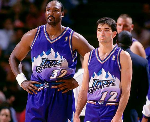
At this point, I just want these back:

Agreed 100%. The only thing I can think of with the gold to orange gradient is Arches National Park?

I miss these so much.


BTW, this is my most recent addition to the jersey collection. A beautiful 1996-97 game worn Antoine Carr home jersey. Home gamers from that year are so hard to find. Excited to get this one.
Originally posted by Niners99:
Agreed 100%. The only thing I can think of with the gold to orange gradient is Arches National Park?

I miss these so much.


BTW, this is my most recent addition to the jersey collection. A beautiful 1996-97 game worn Antoine Carr home jersey. Home gamers from that year are so hard to find. Excited to get this one.

I was thinking the same thing. Maybe the backdrop will be the Arches. You could have the mountains, the Jazz note, and the Arches as an alternate. It wouldn't be the worst thing and would make sense for the color scheme.

Good find on the AC jersey. It would be awesome if it came with some goggles
Originally posted by saniner:
Originally posted by Niners99:
Agreed 100%. The only thing I can think of with the gold to orange gradient is Arches National Park?

I miss these so much.


BTW, this is my most recent addition to the jersey collection. A beautiful 1996-97 game worn Antoine Carr home jersey. Home gamers from that year are so hard to find. Excited to get this one.

I was thinking the same thing. Maybe the backdrop will be the Arches. You could have the mountains, the Jazz note, and the Arches as an alternate. It wouldn't be the worst thing and would make sense for the color scheme.

Good find on the AC jersey. It would be awesome if it came with some goggles

The Big Dog!

Originally posted by Niners99:
The Big Dog!


Originally posted by saniner:


Not too bad I suppose.
Originally posted by JustinMT:

Not too bad I suppose.

Meh. I dont like the cut with those sleeve/neck stripes. Looks weird. We need to ditch the navy blue and get back to either 90's color scheme.
  • Jiks
  • Member
  • Posts: 29,220
Really?! ^^^^

Yay!!!(sarcasm)
Originally posted by JustinMT:

Not too bad I suppose.

Not bad at all. Every team went with very simple designs for their jerseys. Ours isn't that different from last year. The Nike design jerseys are going to be out there for sure. Those are the ones I'm waiting for.

All seem to be simple designs this year
Originally posted by saniner:
Originally posted by JustinMT:

Not too bad I suppose.

Not bad at all. Every team went with very simple designs for their jerseys. Ours isn't that different from last year. The Nike design jerseys are going to be out there for sure. Those are the ones I'm waiting for.

Way too much yellow on the dark jerseys IMO.

The whites are fine.


Great move. Probably one of the bigger moves of the off-season.
Best move of the offseason!

Originally posted by JustinMT:


This is not an official uniform. These were estimated mock ups by a website based on information. The logo and numbers is exact, but color and sides are a total guess.
Open Menu Search Share 49ersWebzone