Originally posted by chico49erfan:Originally posted by GoldMineForty9:
lets see something then...since were noobs and all why dont you show us how its done?
You mad?
no just curious what a logo would look like without the requirements
There are 254 users in the forums
Originally posted by chico49erfan:Originally posted by GoldMineForty9:
lets see something then...since were noobs and all why dont you show us how its done?
You mad?
Originally posted by TheGoldStandard:Originally posted by Buonaparte69:
My latest design :
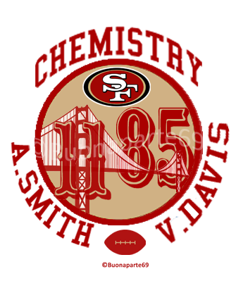
(I sent a non-watermarked version to kre8tivemind and VD)
Winner.
Originally posted by teeohh:Originally posted by TheGoldStandard:Originally posted by Buonaparte69:
My latest design :
(I sent a non-watermarked version to kre8tivemind and VD)
Winner.
I think it would be better without all the other words outside but it's niceeeee
Originally posted by Oakland-Niner:Originally posted by teeohh:Originally posted by TheGoldStandard:Originally posted by Buonaparte69:
My latest design :
(I sent a non-watermarked version to kre8tivemind and VD)
Winner.
I think it would be better without all the other words outside but it's niceeeee
If you get rid of the word chemistry, I think you got a pretty good logo there.
Originally posted by GoldMineForty9:Originally posted by chico49erfan:Originally posted by GoldMineForty9:
lets see something then...since were noobs and all why dont you show us how its done?
You mad?
no just curious what a logo would look like without the requirements
 Someone has a hard time differentiating between literal and figurative meaning.
Originally posted by TheGoldStandard:Originally posted by Oakland-Niner:Originally posted by teeohh:Originally posted by TheGoldStandard:Originally posted by Buonaparte69:
My latest design :
(I sent a non-watermarked version to kre8tivemind and VD)
Winner.
I think it would be better without all the other words outside but it's niceeeee
If you get rid of the word chemistry, I think you got a pretty good logo there.
and crazily enough take out the 49er logo, its out of place

Originally posted by PTulini:Originally posted by TheGoldStandard:Originally posted by Oakland-Niner:Originally posted by teeohh:Originally posted by TheGoldStandard:Originally posted by Buonaparte69:
My latest design :
(I sent a non-watermarked version to kre8tivemind and VD)
Winner.
I think it would be better without all the other words outside but it's niceeeee
If you get rid of the word chemistry, I think you got a pretty good logo there.
and crazily enough take out the 49er logo, its out of place
Why not just move the 49ers logo down to the bottom in place of the football?


Originally posted by boast:
just sent this design to VD........
