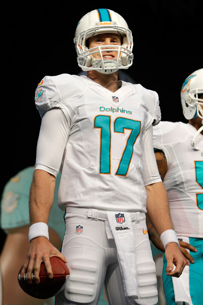
I guess I'm outnumbered here but I really like Miami's new unis... I think they look simple, clean, and well-designed (and while I'm no expert, I've taken a few design courses).
Minnesota's aren't too bad either.
Not a big fan of Jacksonville's because I've never liked black pants too much. Can you imagine how hot those unis get playing in Florida in August and September? Yikes!
I'm pretty old school so I've always liked simple, clean looks with NFL unis. IMHO, the best ones are the ones that haven't changed too much over the years....Green Bay, Pittsburgh, San Francisco, Chicago, NY Giants, Indy, NY Jets, Oakland, and KC to name a few. Those are all classic....simple, colorful, and timeless.
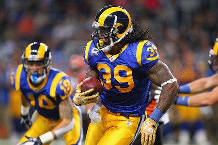
I think the Rams should go back to those great blue unis with the blue and white helmets (they wore those until the early 70s when they brought yellow into their color scheme).
The Seahawks, on the other hand, have never had a really good uni in their existence. Good team now tho'.
Cheers!
[ Edited by nw9erfan on May 2, 2013 at 12:14 AM ]


 Simple is better when it comes to football. If anyone decides to make significant changes to the Niner threads, I will punch someone.