Originally posted by phatbutskinny:
Originally posted by defenderDX:
Originally posted by phatbutskinny:
Originally posted by defenderDX:
Originally posted by baybreaker707:
Originally posted by phatbutskinny:
Originally posted by baybreaker707:
Originally posted by phatbutskinny:
Originally posted by baybreaker707:
Ok I might be doing a little too much now, but it looks kind of cool with the tank.
wow this is amazing
make me a sig!
i can try, give me the deets of how you want it.
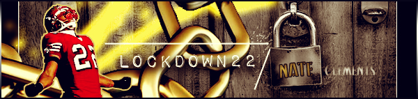
i dont want any speciic player just anything 49er related and keep it modern and put phatbutskinny somewhere in a sick font
Let me know if this works for ya...

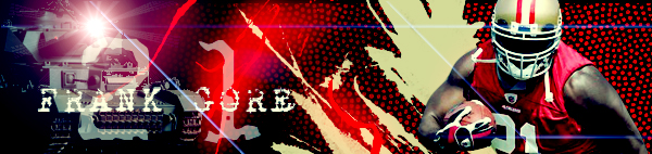
ewwwwww go with the current 49er colors not the garbage ass one's we had in 2008. 
dont listen to him baybreaker. dude has the ugliest sig in the world
thanks a lot man!
LOL you're such a dumbf**k. Considering the entire first page is nothing but love for the final sig. And yes, those colors ARE ugly as hell. Not the sig, the sig is beast, I'd just prefer the cherry/white uni's rather than the bergundy/black one's.
ok dood, its personal preference so u can have ur sig i'll have mine. i just called u out because you are hating on his sig when yours might one of the ugliest sigs i have ever seen. and i guarantee half the people on the first page were just being nice
That's the THING, I'm not hating on his sig, I'm criticizing the pictures he used FOR the sig. Big difference lmfao. The point of MY original post was to show the PROGRESS, and to show the distinct difference of how garbage it was at first, to the improvements that were made towards the end.
The heart sealed the deal. Winner.