Originally posted by defenderDX:Originally posted by baybreaker707:Originally posted by defenderDX:Originally posted by TeambyTheBay:Originally posted by defenderDX:
So I wanted a forum sig in reference to the 49ers, of course, so here are the drafts that he came up with.
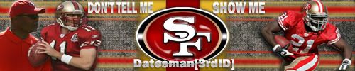
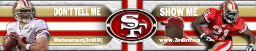
The text has the "DON'T TELL ME SHOW ME" slogan. Also, it has "Datesman[3rdID]" Datesman is my last name, and that little tag is a group I'm in to promote a recruiting game for the U.S. Army.
It was sorta a long process, because it took a while till I was completely satisfied and got exactly what I had envisioned. I'm kinda picky.
Anyways, here are the drafts he made coming up to the final version!!!
First Draft/Version
Second Draft/Version
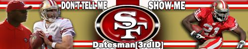
Third Draft/Version
4th Draft/Version (The splattered effect he used was a little too weird for my liking lol)
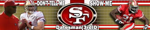
5th Draft/Version (Getting there!!!)
6th Draft/Version
7th Draft/Version
Final
So yeah, tell me what you guys think!!
youre a picky ass mofo
yep.just compare the very first draft to the final... its amazing lol. first one was sooo garbage!!
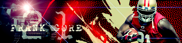
I specifically wanted the sig to have pics of the niners from 2009. Mainly because I like the throwback/ cherry red uniforms way better than those ugly ass bergundy red/ black one's.
Those are FUGLY IMO.
Lololol you obviously don't use photoshop


You don't have to know how to use photoshop to know these are ugly. BTW I do use it, so now what?