Originally posted by gamechanger:
I kinda like the white gold idea...
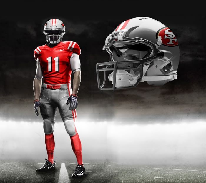
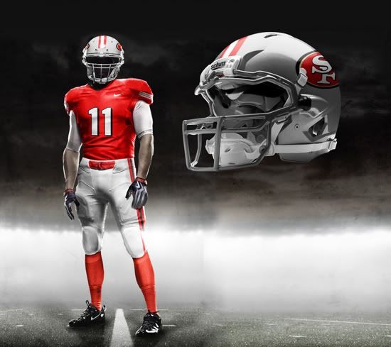
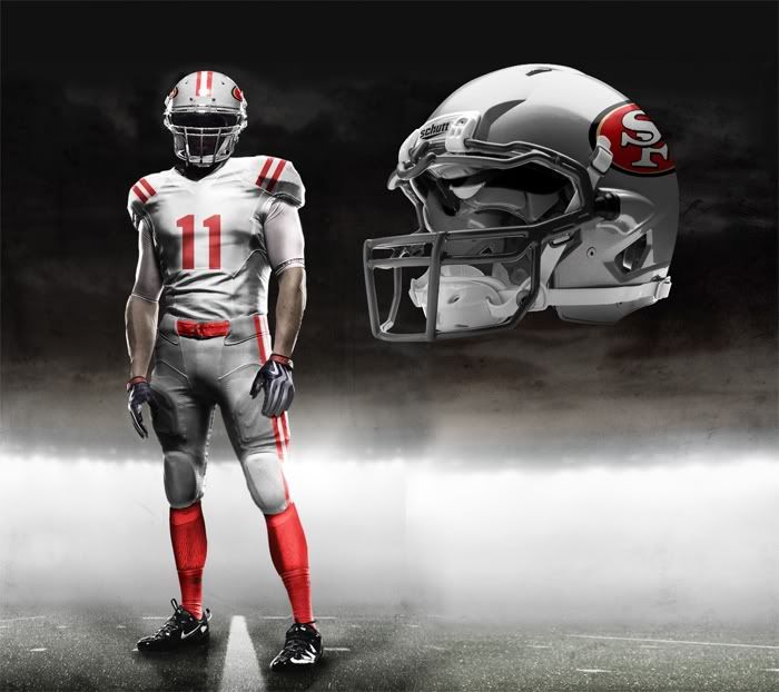
I don't think Harbaugh would like our team looking like Ohio State.
There are 151 users in the forums
Originally posted by gamechanger:
I kinda like the white gold idea...

Originally posted by Dr_Bill_Walsh:i dont have a 4 banger but i dont think theres anything silly about an EVO or STI those 4 bangers would rape most V8s
Originally posted by gamechanger:
Originally posted by Dr_Bill_Walsh:
have fun with the riot by a majority of niner fans if those are ever worn. the niners are NOT a flashy, oregon U, uni guinea pig type team...the team is along with the bearsm packers, cowboys, raiders, colts etc. among the "classy" uni crowd...not the dumb, dated in 3 years cardinals, seahawks, bengals, falcons crowd. most players will like whats looks sharp and timeless...not tacky and overly busy. i don't care how long it took whoever made the above mockups...its the end result that matters & the end result is still meh...the team has moved beyond the late 90's fad of BFBS (black for black's sake) and that yuck cardinal red...IMO if a past uni from 50's were an inspiration, it ought to be something more distinctive than the drab 1956 uni (all white helmets and pants?!) you're entitled to your preference, but i'm unconverted in my preference for 1955/94 and 1962-63 as a basis for an alternate/throwback.
Keep posting your ms paint unis and try presenting it to a team vs someone using the Nike template lol.
psssh....your disparaging of my method of presenting my designs illustrates PERFECTLY (as a metaphor for our differing uniform design preferences) why your arguments IMO fails. what you deem "MS Paint" (i actually use a template from http://www.gridironuniforms.com/, editing it with Adobe PS if you must know) works perfectly fine for me in expressing my idea of what i want the uni to look like in an economical, succint, no-nonsense manner. Your preference someone's seemingly more realistic and complex illustration with all its superfluous renderings and dramatic shadowing and lighting cannot compensate for what I feel is a flawed design (if they do a corresponding 1955/1994 or 1962-63 rendering I might be inclined to liking it). think of it like those silly 4-banger cars that get all souped up with spoilers, lighting, flashing lights, flatulent mufflers and god knows what else...all that fluff in the end cannot conceal a glaring and readily apparent difficiency.
your entitled to your opinion, but i'll stick with mine.
Originally posted by hondakillerzx:
i dont have a 4 banger but i dont think theres anything silly about an EVO or STI those 4 bangers would rape most V8s
 i had more of a daewoo in mind when i though of that metaphor...let's not take the conversation any further in that silly tangent!
Originally posted by gamechanger:
Here's what I did...
Originally posted by gamechanger:
I kinda like the white gold idea...


Originally posted by KowboyKiller:
This thread is staring to scare me about next year. Nike better not start f**king things up thinking everyone would like to see NFL teams look like the Oregon Ducks.
Looking Ahead to Next SeasonMany fans are taking it as a given -- some with dread, some with glee -- that Nike will give the NFL a wholesale makeover when it takes over the league's uniform contract in 2012. Speculations on what a Nike-fied NFL might look like, cooked up by some enterprising Photoshoppers, have been circulating for nearly a year now. Although the league and Nike confirmed that those designs are not legit, they still represent some people's worst fears (or fondest dreams, depending on whether you're an old-school or new-school kind of fan).
Uni Watch's position is that all this fretting and fantasizing is largely moot, because the NFL is likely to look pretty much the same next year as it does now. Here's why:
• It's a long way from the NCAA to the NFL. People's perceptions of Nike, whether positive or negative, are driven primarily by the company's college football uniform designs. But the NFL is very different from the NCAA. For one thing, colleges are using newfangled uni designs as recruiting tools to attract 17-year-olds and to sell merch to 20-year-olds. But the NFL doesn't need to recruit anyone (players play for the team that drafts them), and the league's consumer base is, on the whole, older and less trend-driven than the NCAA's. Also, many top colleges change their uniforms every season, while NFL teams aren't even allowed to change their uniforms more than once every five years, so there's a lot more design stability in the pro ranks.
• It's the dog, not the tail: Nike (or any uniform company) can't just walk in and change everything on a whim. Nike, like any vendor, can only do what its clients agree to. And in this case the clients are NFL team owners, a bunch of very conservative businessmen who have enormous investments in their successful brands and who, in many cases, have owned their respective franchises for generations. These are not the kinds of guys who are going to put their teams into the Nike design centrifuge. Can you really see the Rooneys letting Nike give the Steelers a major face-lift? Or the Maras? Or the Hunts? No way.
• Historical precedent. It's easy to forget this now, but Nike outfitted many NFL teams back in the 1990s, and the world kept right on spinning. Now, it's true that Nike came up with the Broncos' current look, which was revolutionary when it was introduced in 1997. But think about it: Nearly 15 years later, not a single other NFL team looks anything remotely like the Broncos, which just proves the point that most NFL franchises prefer to stick with tradition. Will a few teams come out with wacky designs next year? Yeah, probably. But there's nothing new about that. Most teams will still stick with what they've got.
• Hints have already leaked. Jaguars equipment manager Drew Hampton recently posted a series of tweets about the Jags' 2012 uniforms. The gist: No design changes, just a few tweaks in the tailoring. That's gonna be the story for most NFL teams.
• Potential new rules are a shot across the bow. Word came out over the summer that the NFL was considering new rules limiting alternate jerseys to non-prime games prior to Week 10, because the proliferation of alternate looks could "potentially compromise a club's national brand equity." Does that sound like a league that's planning to go bonkers with crazy uniform designs to you? If anything, it sounds like a pre-emptive move to ensure that Nike will have little effect on the league's look.
Add it all up and you have a league that you'll have no trouble recognizing as the NFL in 2012. A few teams will no doubt go for a face-lift, and we'll hear the usual claims about space-age fabrics that are lighter, faster and so on (seriously, can the anti-gravity jersey be far behind?). But a large-scale redesign? Ain't gonna happen.
Originally posted by Dr_Bill_Walsh:
lol, my apologies if my analogy offended those who drive 4-cylinder carsi had more of a daewoo in mind when i though of that metaphor...let's not take the conversation any further in that silly tangent!
but


BRAVO gamechanger! i applaud you taking me up on my challenge and fulfilling my wish to see a rendition of the 1962 throwback (as well as a very palatable version of the classic standard red and gold uniform)...looks very nice indeed. Nike need not anything more in my opinion, but take the best of what past uniforms the team has had and translate into a crisp, classy yet modern iteration. now show me a likewise rendition of the 1955/1994 shadowed numeral uniform (but with the 1962-63 "white gold" helmets) and you will have truly converted me.

Originally posted by gamechanger:


Originally posted by gamechanger:


 but thank you very much for these...i envy your skills in making the 3D rendings, but they're great nonetheless
Originally posted by zillabeast:
I don't care what they thought about silver on the 49ers uniform back in the Mesozoic era, but it has absolutely no place on a 49er uniform in this day and age.
Leave the opposite colors to the Cowgirls. RED AND GOLD FOREVER!!!!
 white gold

Originally posted by Candlestick_Monsta:
I understand the current look is going for the throwback tribute to the 80's.......but I still wish there was some gold on the jerseys. Hell, I may be reaching here but also the SF logo of the sleeves. Bring back gold to the jerseys! That too much to ask?