Originally posted by valrod33:The Texans one is badass
thats the only good one
There are 154 users in the forums
Originally posted by valrod33:The Texans one is badass

Originally posted by Young2Rice:
ours is one of the worst on there.
Originally posted by 49erfeeeever808:
^^kinda looks like a pokemon.
Originally posted by gold49er2183:
Originally posted by NinerFanMT:
Why is the Chargers' logo a horse? Their name has never made "horse" pop up in my head before.
Charging in a battle sense maybe?

Originally posted by 49erfeeeever808:
fk'in awful.

Originally posted by 9ers:
Did dood not even try with the Niners? Probably has no clue what 49ers means.
Originally posted by ghostrider:
Originally posted by 9ers:
Did dood not even try with the Niners? Probably has no clue what 49ers means.
Those are pick axes in the 49ers logo. I don't like it, though, but I'm pretty sure he knows what 49ers means.
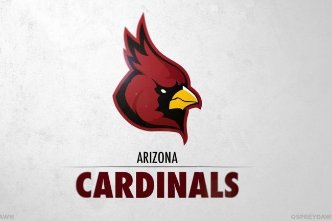
Most of them I do like. The Redskins and Browns are probably the best of the bunch with the Titans next. I also think the Cardinals, Jets, Bills, Bears, Falcons, Broncos, and Raiders are all improvements. I think it's kind of cool in the Bears logo how he incorporated their "C" in the teeth. Nice touch.